This is the second in my series of evaluating open access publishers who have the good sense to make the XML as well as their PDFs of their documents available. To emphasize why I am doing this, I support open access, and I particularly advocate the publication of XML, which is supposed to be the definitive version of an article. So although I am going to criticize a lot of what I see, I thank any publisher who allows me to see the XML. In this post I am “picking” on Frontiers. Like PLOS, they are one of the well known guys that we look up to to lead the way to more OA.
I looked at 2–3 papers from Frontiers in Physics, so they would contain some math. Let’s look at this paper by Iglesias et al, and first the PDF.
Single or double column?
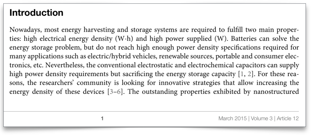
The first page is set in a single column, and the rest of the paper is double column. I am generally in favour of single column for modern journals, the only exception being where a journal is a printed one and costs need to be minimized. I don’t think Frontiers journals are printed, so why not keep the single column throughout? In any case, with careful design publishers might be surprised how much they can fit into a single column page.
Why do I prefer single column?
The main reason for my preference is that double column pages are much harder to paginate, and are especially difficult to paginate automatically, e.g. from XML files. The combination of single and double column “floating” figures and tables almost always need manual tweaking by a human. As we try to automate the publishing process more and more, we should avoid page designs that need human intervention, if possible.
The first page
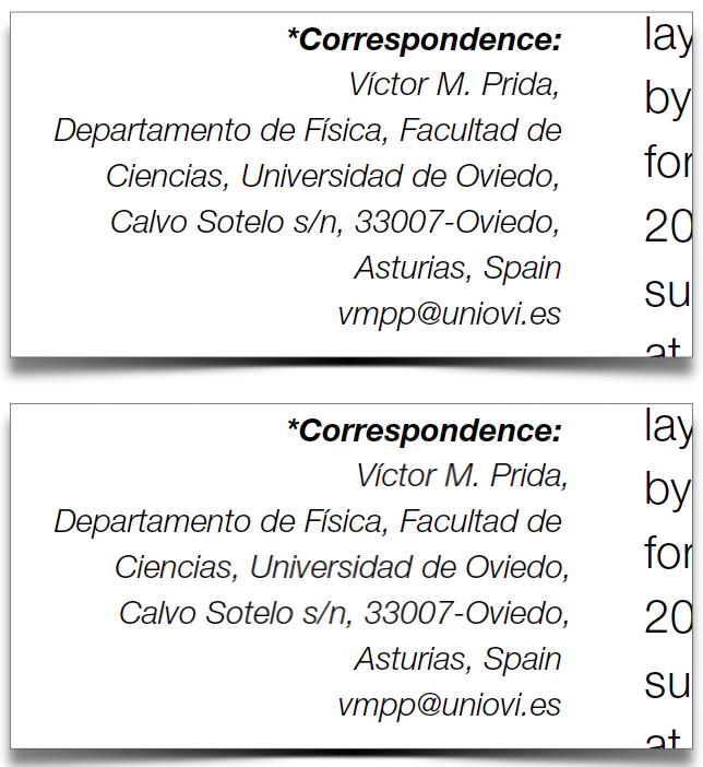
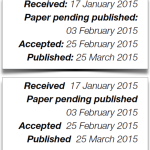
This is generally a good looking page with a side margin containing metadata. It is delineated by a strong gap separating it from the main text. The right justification works well and it is easy to read. The typeface, Helvetica Neue I think, works nicely for short pieces of text like this. Some suggestions to make this sidebar even nicer – how about “hanging punctuation”, where the full points, commas etc, push into the right margin. I did a quick before/after test:
I know I am splitting hairs here but just couldn’t resist!! You can see in the second picture the commas are “hanging” in the gap, further accentuating the strong vertical alignment. This can be done automatically in a good pagination system, so there is no extra work, just setting preferences.
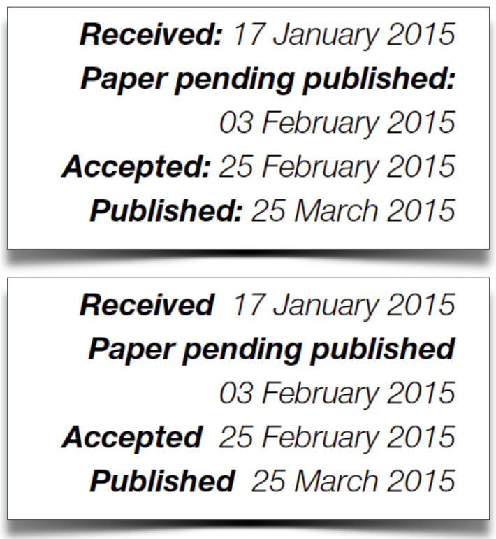
The bold font also works well in identifying the metadata. So first we can quickly identify what data is provided, then home in and read it if we really want. Again, due to my incurable obsession with type and layout, I wondered whether this would work better without the colons:
I think it would. This is a good case of “less is more”. The strong bold typeface is sufficient to tell us that important data is coming, and a colon is therefore redundant in my view. A small point perhaps, but a lot of small points can work together to produce a nice design.
The dashes should be longer, i.e. en-dashes not hyphens, as in this case:
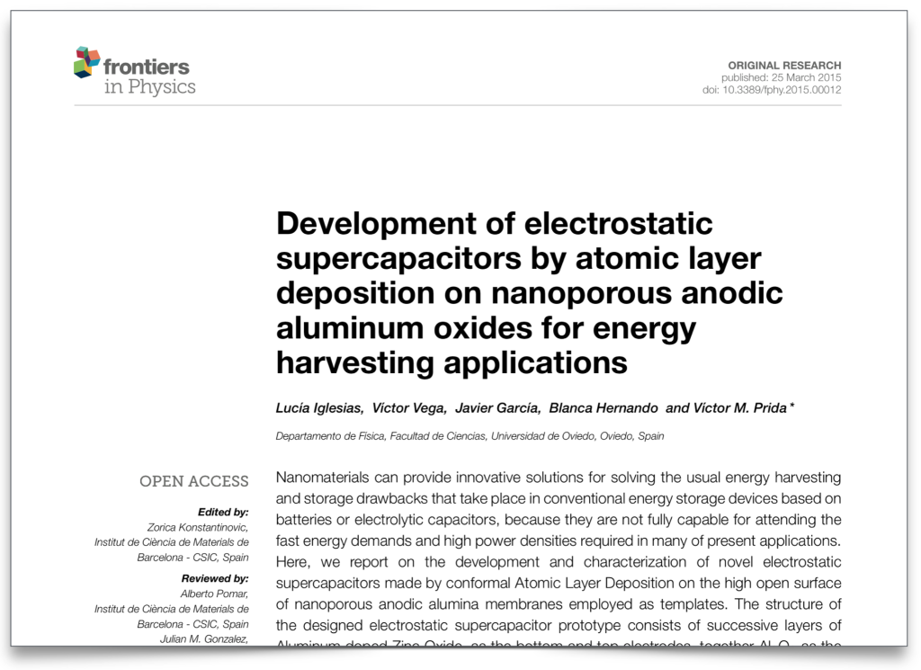
The title page looks pretty good:
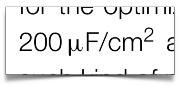
My main comment is that the Helvetica Light (or equivalent used), while perfect for the sidebar, is not well suited to scholarly text, even in the abstract. Again, this is purely personal, but it does not convey authority to me. Also, if there are any mathematical formulae in the abstract, they will not look that good, as in this example where the $\mu$ does not sit well with the rest of the equation:
The keywords label and the keywords themselves are in bold. I think these could follow the sidebar with the “Keyword” label bold italic and keywords themselves italic light.
Next we come to the body text:
It is nicely set in Minion Pro. There are some 90 characters (inc. spaces) in a line, and this is about the maximum for comfortable reading. Spacing is quite consistent and hyphenation the right level. Now here is a suggestion, although I have not seen any scholarly journal use it. Look at the right margin. It is set to justified, but it looks a little bit ragged, right? this is because the hyphens are very thin characters and they look as if they need to shift to the right more. So a little “hanging punctuation” as mentioned above, would make the para look even nicer. This should be a one-off setting in the pagination system.
I don’t see why the citations are in grey. There is little contrast with the text and a second colour would be better, as with the Volume information at the bottom of the page. And a thing typeface (like Helvetica Light) in small point and in grey can be hard to read as well as present printing problems.
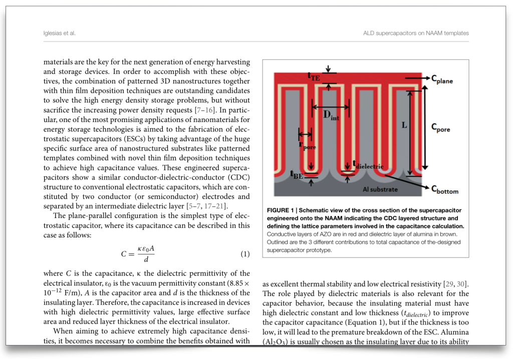
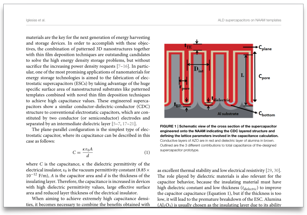
The second page onwards are set in double column. The first thing I noticed is that all graphics have a thin border around them. I applied the “less is more” rule and took out the border. I prefer it without the border, as it makes the page cluttered, and also there is always a chance it might interfere with the content of the graphic. You can see the difference below:
An interesting style is to have “Figure 1” etc in bold:
I can’t make my mind up whether I like this, but I am all for experimenting with type to make articles more readable. The equations are not too bad, but I am a bit alarmed at the fact that variables and labels are all in the same typeface. I’ll prise open the XML later. 😉
A small point about the figure captions. These are set ragged right, rather than justified. I think they would sit better if they were justified too. It is always dangerous when mixing justification in the same document. It can work but only when used carefully. I also notice an unusually large word spacing in the figure captions. I can’t see any good reason for having this, and it detracts from the good setting of the body text.
So far not looking bad. I have a feeling it’s the calm before the storm. 😉
XML
OK, time to roll up our sleeves again! The thing about XML is that everyone looks at the tags, and parsing the XML ensures the structure of tagging is correct, but only a few people (like nosey people like me) look at the content. To me, parsing is like going into an art gallery and admiring all the wonderful picture frames, but not looking at the pictures themselves!!
I will look at some snippets of the PDF, and then the corresponding XML. Here is a citation to references 3–6:
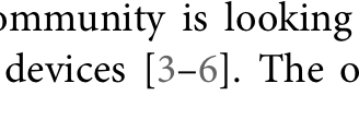
and here is the corresponding XML code:
The cryptic – is just the code for an en-dash, or a long dash. So we can see that the XML is also coded as [3–6]. But this is just a contracted typographic form of [3,4,5,6]. So the XML, which is the definitive “future-proof” version of the document, has no information about references 4 and 5. This is a common way of coding XML and I can’t pick on Frontiers specifically, but unfortunately it does not make for good XML. I am guessing it makes it easier for some typesetters to convert the XML to PDF because they don’t need to write a conversion script. 🙁
Math
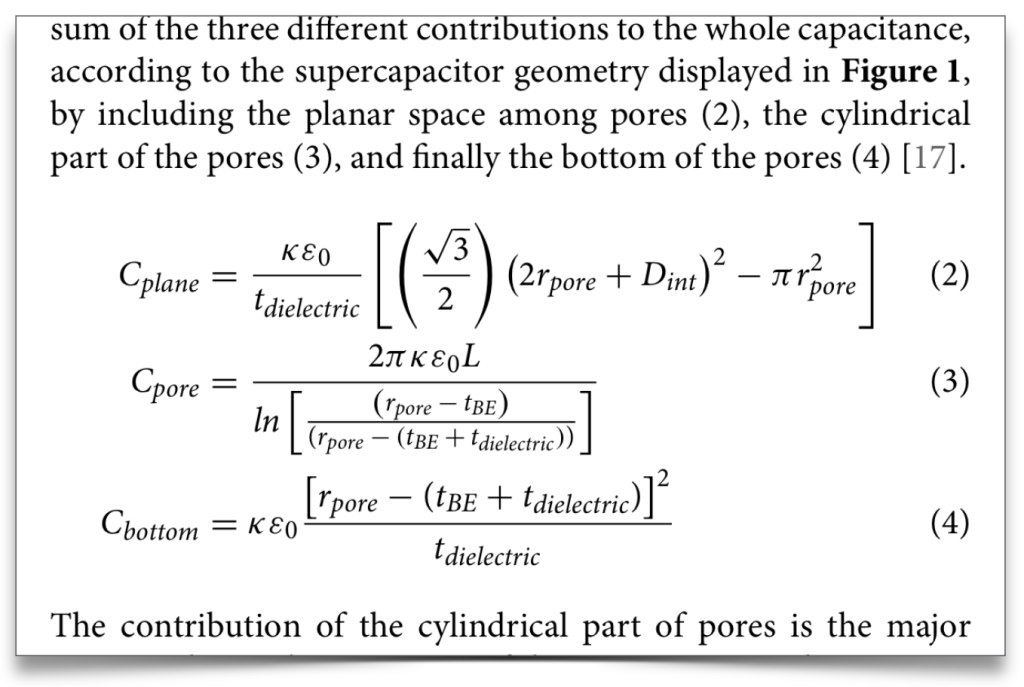
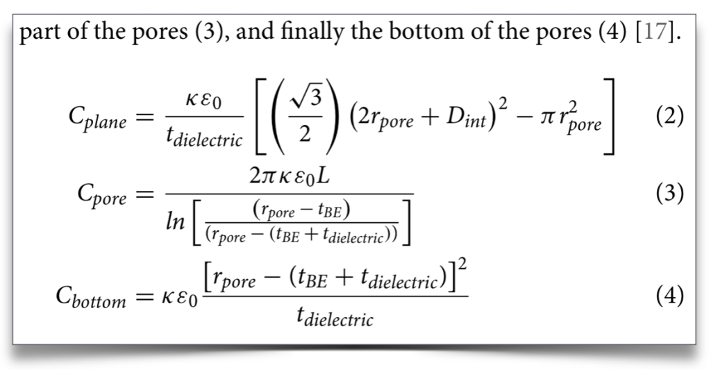
OK, my speciality. 😉 I gave PLOS a hard time in my assessment of their files. Here is an equation from the Frontiers paper we are looking at:
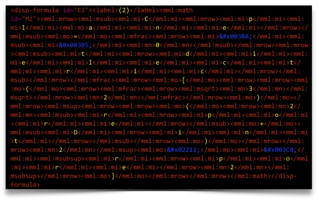
The look is not bad as I say, but the MathML shows exactly the problem that PLOS had, in that every letter of every word is coded as a variable, so “plane” is interpreted as $p~\times~l~\times~a~\times~n~\times~e$, which is clearly nonsense. You can see the word spread out in yellow below.
This is particularly bad news for accessibility. You can imagine what an automated reader for the blind will make of this! (I note the irony that these screenshots themselves are not accessible, but I could not get WordPress to to a good syntax highlighting!) I am getting more and more depressed. If this is the industry standard way of coding math, then we are in deep poo!
References
Here is a reference in the PDF:
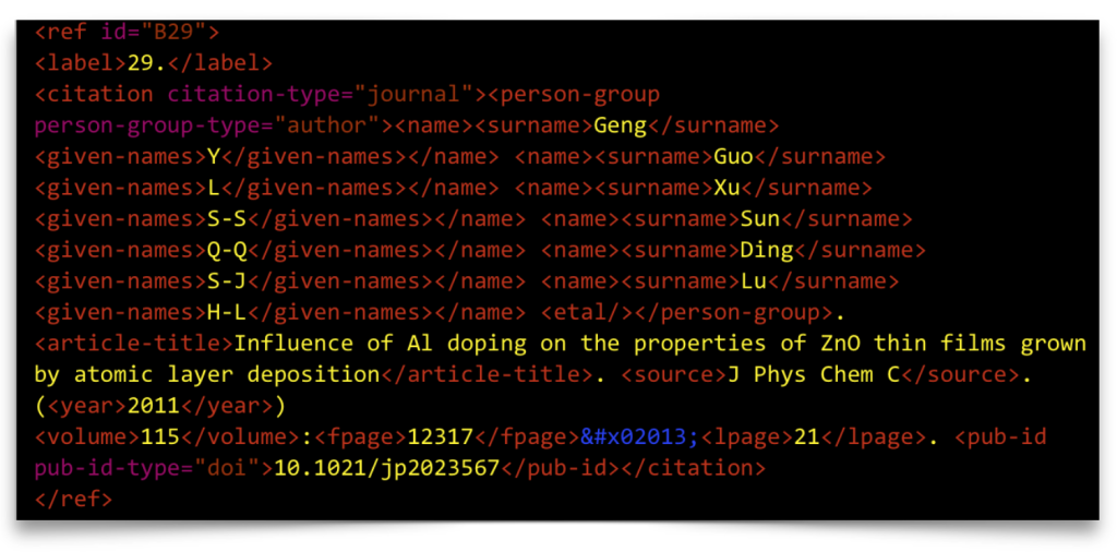
Full marks for using bold and italic at least, which worryingly many publishers are ditching. And the serif font, at least to my eye, is so much more readable and authoritative. The “J” would look better tied to the “Phys”, but all in all a nice traditionally typeset reference. Here is the corresponding XML:
This is using NLM’s mixed citation, that allows punctuation (and any other matter) to be inserted outside tags. The punctuation is not treated as data, but helps typesetters convert the XML to PDF. In the PDF, the page number is given as “12317–21”. So, what is the last page? Anyone 7 years or up will know that it is 12321, but that for good reasons of readability, it is contracted to 21, because “12317–12321” is redundant and harder to read. So what should the last page be coded as in XML? That’s right, 12321. But if you have a look at the XML, you will see
<lpage>21</lpage>
and there is an en-dash just before it. So it has been coded just as it is printed. This is really hard for me to bear, but unfortunately it is lazy workaround that people use because they don’t want to convert the XML properly. It is a classic example of content being sacrificed for form, just as we saw in the citations above. 🙁
I am generally not a fan of mixed citation, especially in STM content, where most references have a fixed style. I prefer element citation, where only data is kept in the XML, and typesetter writes a “filter” to insert the punctuation where required. Using mixed citation, it is very tempting to put data that outside the tags when an operator is not sure how to tag some text. This is an easy cheat, as the content is spewed out perfectly in the PDF, which is checked in the proof, but messes up the XML that is not checked (except by Uncle Kaveh!). Here is a good example from another Frontiers article where the all important Patent number is left outside the tags because someone didn’t know where to put it, so effectively the Patent number has been given the same level of importance as a bracket!
Graphics
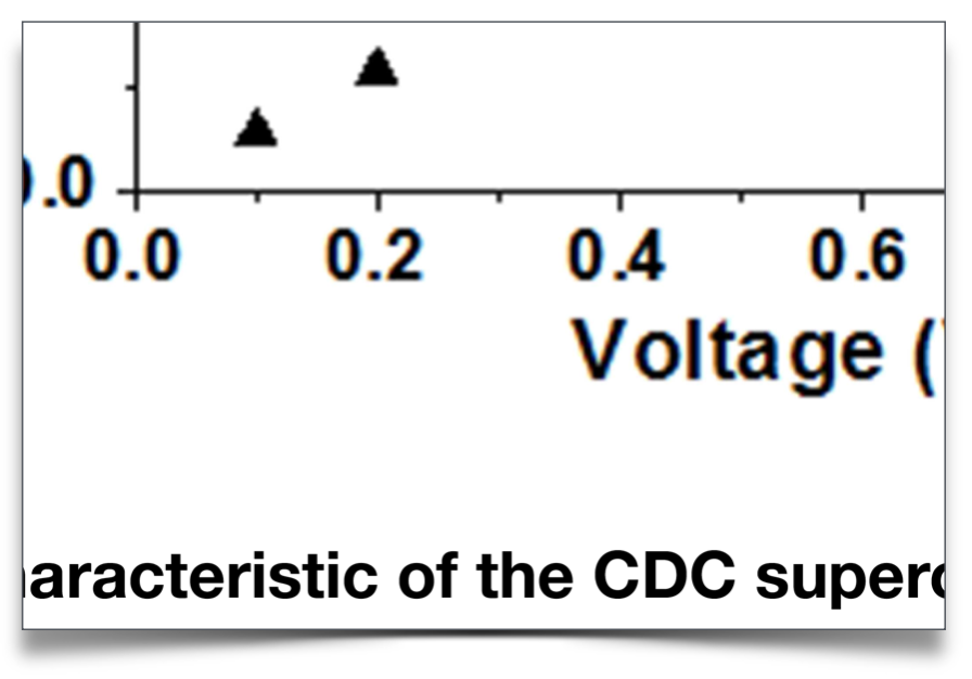
I am afraid it’s bad news, just as with the case of PLOS. It seems all graphics are converted into dumb bitmap images, making them inaccessible for ever, bloating the size of the PDF, etc. Even simple line art is saved as jpeg. You can see the quality degrade as we zoom in:
The resolution seems consistent in each file but not across files. In the file we are looking at it is around 1500dpi throughout which is generally too high for any but the highest res printers. Really, the resolution should depend on the type of image: line art, grey scale, etc.
So here is a plea again to all publishers. Do not butcher all graphics into bitmaps. Publishers often talk about “adding value” and of course they do in general, but bitmapping graphics is systematic subtraction of value!
Conclusion
I hope I have not been unfair in my assessment of Frontiers. Clearly I have taken just 2–3 files and reported on what I found, so this is not statistically significant, and clearly I am giving my personal view. Frontiers is seen as a leader in Open Access and I want them to be even better than they are now. 😉

