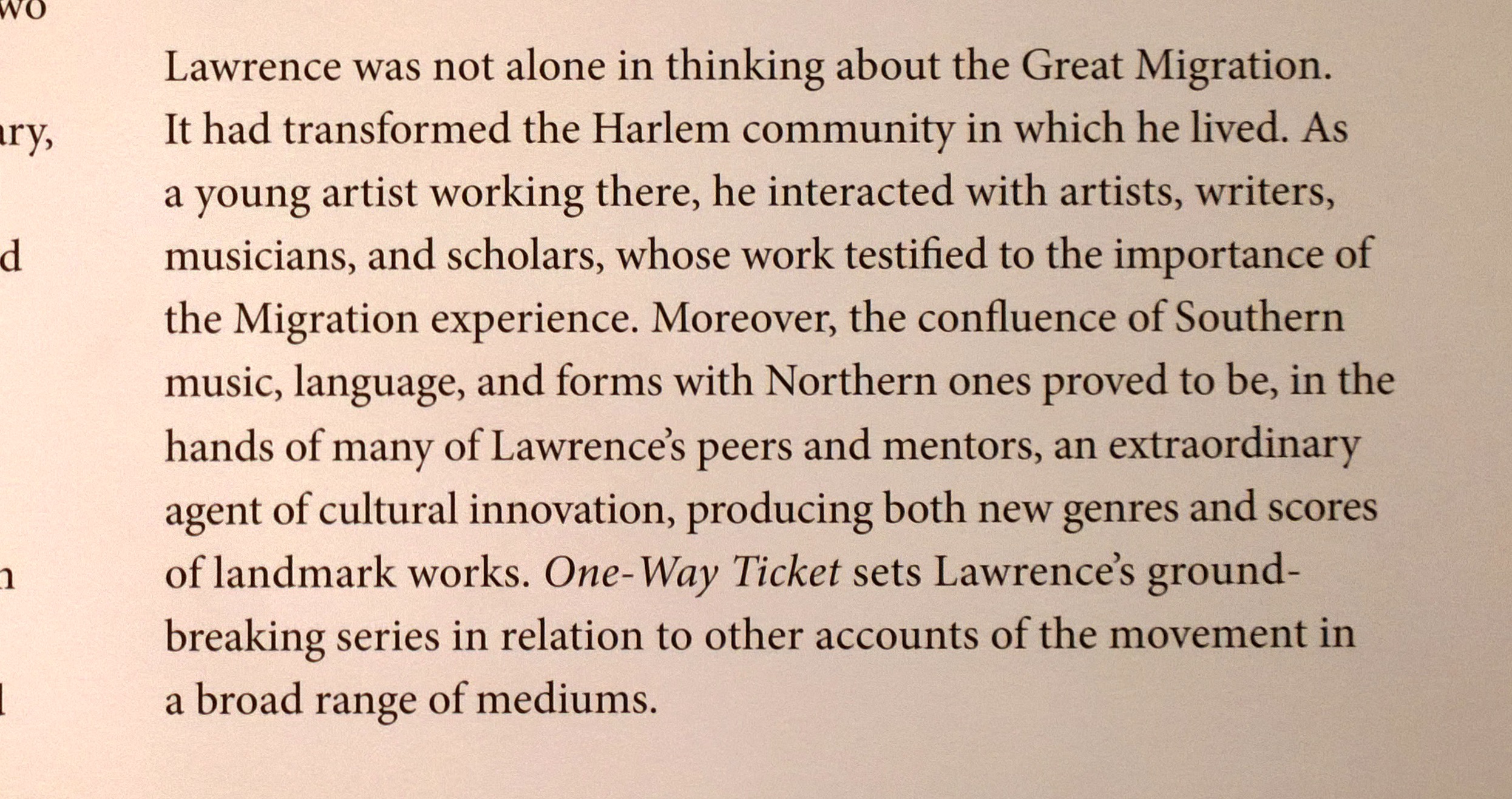
I love typography, and I have been to several international conferences on the subject. The problem is that now I find it concentrate on the content of a piece of text, but look at the type instead, whether it is good or bad! Two days ago I had lunch with a friend who has a senior post at MOMA. He offered me a day pass to the museum as a staff guest, which I gratefully accepted. He recommended the Jacob Lawrence Rural Migration series which documented in a simple, moving way, the migration of African Americans from the South to the North of the US. I really enjoyed the childlike pictures showing what life was like, but my most vivid memory is, I am embarrassed to say, the typography of the text welcoming visitors!! This is the introductory text:
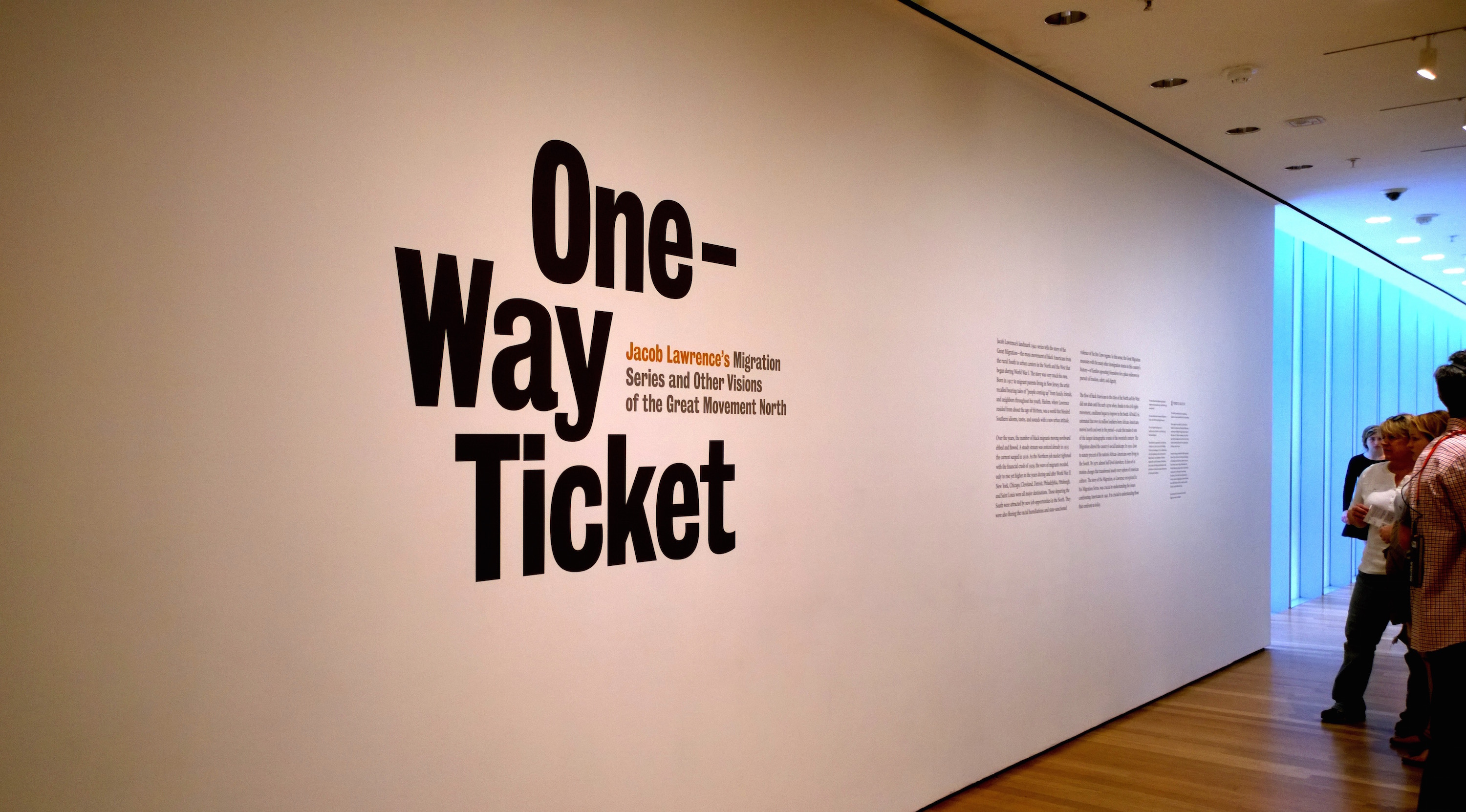 I guess most people would see the title, “One-Way Ticket”, the subtitle, then read the body text and move on to the exhibit. But for me, this was as good as the exhibition itself! I spent a long time lingering and taking photos. Here is what I see:
- A gigantic, perfectly flat white wall tantalisingly drawing attention to the small areas of text. (White space is so often underestimated by designers!)
- Beautifully set title. “One-” is lonely and way to the right, as if it has departed with no way of coming back. The hyphen points to an uncertain future. The leading is tight, with the “y” tucked into the space below. (Normally I am an advocate of content being separated from form, or style, but this is an excellent example of form and content mixing for good reason. The words themselves are being used as graphical elements.)
- Subtitle not below title as would be normal, but comfortably sitting in a convenient gap – why not?
- For a type nerd, a view of a few paragraphs in the distance with generous white space in between, beckoning attention.
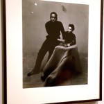
At this point I see a photo and some more text on the other side and like a kid in a toy shop, I move in. I see a stunning photo of Jacob Lawrence and his wife:
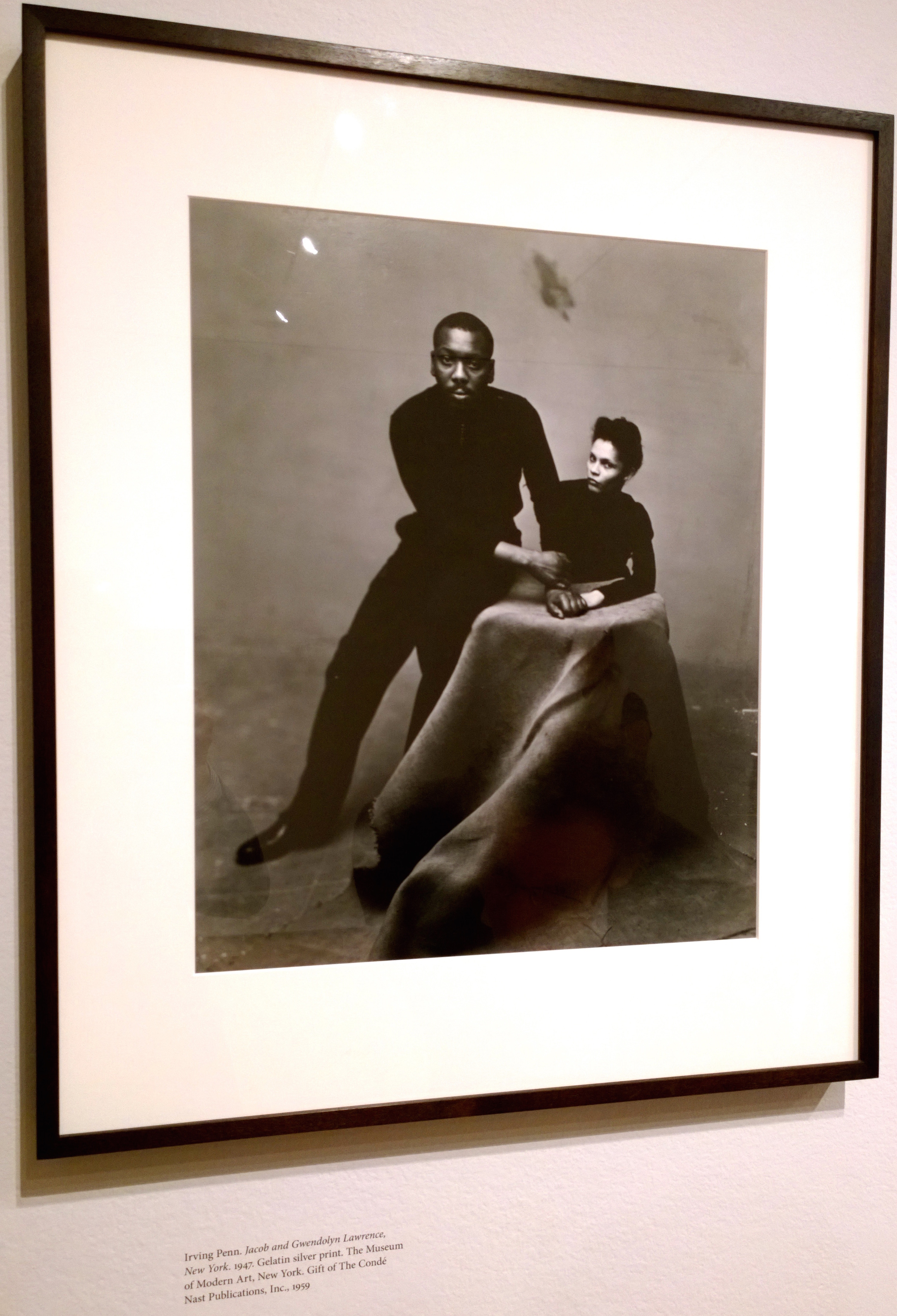
Any sane person would just admire the photo, but what attracts my attention? The caption! So I take a closer look:
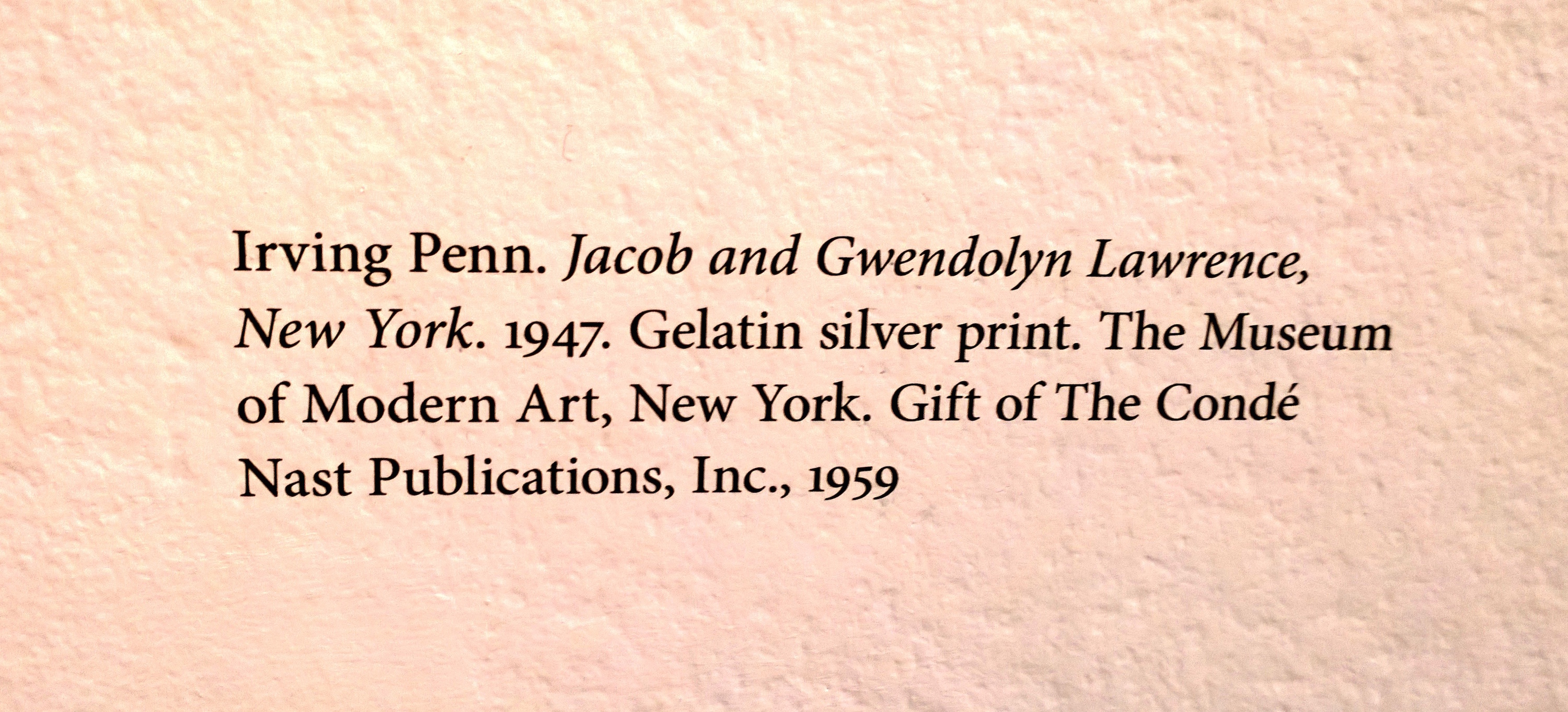
Here is what I see:
- Beautiful type – looks like the timeless Minion Pro, a typeface that I chose for our design for PeerJ – see a recent file here for instance.
- Full points rather than colons or semi-colons, giving an air of formal authority, i.e. the information is correct – don’t argue!
- Ragged-right setting, thus maintaining word spacing throughout.
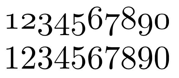
- Beautiful “old style” numerals, with ascenders and descenders which blend in perfectly with text. (Modern numerals work better in spreadsheets, say.) For those unfamiliar, here is a comparison of old style and modern numerals:
- And finally, the whole text somehow printed directly onto the slightly textured wall, adding another layer of authority.
Having lapped up the hors d’oeuvres, I move in for the main course, consisting of two sumptuous columns, perfectly balanced with a generous inter-paragraph spacing:

The leading is small enough to allow reading without losing track of which line follows which, but large enough to allow the imagination to wander.
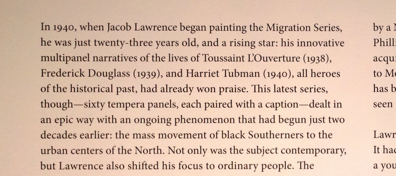
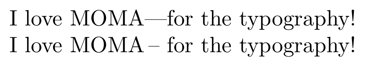
em-dashes (dashes about as wide as a capital M) are correctly used to separate parenthetical text. In UK, an en-dash is normally used, with a full or thin space either side. Both have the same effect as you can see below:
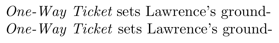
One thing I often do is to look at how italic text joins upright text and vice versa:
“One-Way Ticket” is in italic, but “sets” starts upright text. Sometimes there is not enough of a gap because of the forward slope of the italics. I am splitting hairs, but in this case I would apply an “italic correction” to give this important piece of text some “breathing space”, and set it apart from normal body text. Here is the text without and with italic correction:
and finally, I am still unsure if “Way” should be capitalized or not. I would have set as lower case w, but I stand to be corrected.
And finally…
The idea of good typography (e.g. as MOMA does it), is to pass information to a reader in as efficient a way as possible. Just as a good football (soccer) referee tries not to be noticed and instead to allow you to enjoy a game, good typography should not be noticed. Unfortunately, since the desktop publishing revolution anyone has been able to mix and match fonts, leading etc, with a result that standards have dropped. We should not be going to MOMA to see good type!
Ironically, modern technology allows text in books, journals and even restaurant menus to be set beautifully at no extra cost, but few people seem to be bothered!